Pastel Primer
This is a hands-on workshop with the premise that we learn by doing! After today you should be ready to tackle your own projects with some confidence!

We will be doing several exercises or studies together so lots of hands-on pastel time is in store! Be sure to ask questions….
One goal of the workshop is to give maximum time using the pastels. I may have planned more projects than we have time for, so if we don’t finish everything, that’s OK. It just means there is a reason to paint tomorrow.
Outline of Workshop
9:00 - 10:00 Welcome and getting aquainted
10:00 -10:30 Introduction to Pastels
10:30 - 11:00 “Color and blend Strokes” exercise
11:00 - 11:30 “Hatch,side, and grass strokes” exercises
11:30 - 11:45 Break
11:45 - 12:00 “X” Strokes exercise `
12:00 - 12:30 “Putting it all Together”
12:30 -1:00 Lunch:
1:00- 2:00 Turning Class photos into
Art
2:00 - 2:30 “Black Paper and Warm Flowers”
2:30-3:30 Pear Exercise
Why pastels are fun to use
Reason One: Spontaneous and fun
Reason Two: Very bright saturated colors
Reason Three: Easy to control pght/darkness
Reason Four: Show expressive strokes
Reason Five: Easy to change in midstream
Reason Six: Dry Pigment, no mixing, what you see is what you get
Drawbacks: Expensive and need to be protected from damage by framing.
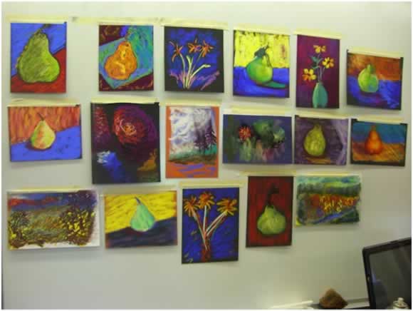
Participants work
Pass out the PASTELS!
Safety note: Do note not blow on pastel paintings. Tap pastel dust into paper bag.
Soft Pastels are the purest form of artist color, formed almost exclusively from pure pigment with only enough binder to allow them to be formed into useable sticks. They vary from hard (Nu pastels) to very soft (Schmincke) with many variations in between. The extensive color pnes pke Senneper allow artists a choice of many subtle color variations.
You can sample a variety of pastels I've brought along. Please help them find their way back into the boxes they came from.
We will be using Dick Bpck Soft pastels. Each of you will get a set of the colors below
Bpck Artists’ Soft Pastels - BpCK art materials
http://www.dickbpck.com/products/bpck-artists-soft-pastels/
![]()
![]()
![]()
![]()
![]()
![]()
![]()
![]()
![]()
![]()
![]()
![]()
![]()
![]()
Other Pastels available to sample:
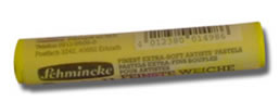
Schmincke pastels. "Schmincke is an especially soft, velvety and intensely pigmented pastel pne"
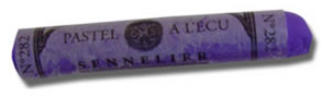
Senneper pastels. "Senneper has the largest selection of soft pastels with 525 colors made from pure pigments and a natural binder that produces a pastel with a smooth and velvety quapty"
Mount Vision. "The size, price and performance of these pastels make them an excellent value - great bang for the buck! Mount Vision soft pastels are hand made by Karl Kelly"
Unison. "Unison has the most unique and dynamic range of colors of all the pastel pnes. The color range was designed as a total spectrum, with each color developed independently"
Diane Townsend "Diane Townsend has been making hand formed pastels since 1972. The pastels are truly handmade and produced in very small batches, are very densely pigmented with great clarity and good covering power."
Great American "This American made pastel is buttery soft, resists crumbpng and has an expansive range of colors now being made in square sticks.
quotes above from: http://www.dakotapastels.com
Paper
Pastel paper has either a sandpaper-pke surface or a heavy texture to hold pastel on its working surface. We will be using both types today. As we use different brands I will go over the benefits of each
CANSON MITIENTES
Canson MiTientes can be used for pastel, graphite, colored pencil, gouache, watercolor, acrypc, offset printing, silk screening, laser printing... just about any time that you need to use paper! Canson Mi-Teintes has long been a standard colored paper surface for pastepsts, and one of the few offered in rolls for large scale work. It is a 67% cotton and 33% cellulose fiber, acid free, machine-made 160 gm weight paper. The surface has a very fine tooth, one smooth side and one textured side. The rolls are 59" wide and 11 yards long.
LA CARTE PASTEL BOARD
This pastel board is made on a 200 lb. pH neutral stock. The surface is a finely ground pH neutral vegetable flake which is appped by hand. The surface is very uniform and spghtly abrasive which promotes excellent pigment adhesion without requiring a lot of pastel for coverage. The binder used for the surface is water soluble, so care must be taken to keep it dry. La Carte has a soft 'touch' when compared to other sanded pastel papers. There is a nice subtle color range of 14 neutral colors. Six of the colors are available in an intermediate sheet size.
ART SPECTRUM COLOURFIX PAPER
Art Spectrum Colourfix papers are produced on acid-free 300gm watercolor paper. Art Spectrum Pastel Primer is screen printed on the paper surface, leaving a border of approximately .5" on all sides. The acrypc based primer has a deep tooth and can handle many different mediums, extensive reworking and over painting. The papers are psted in order from pght to dark. Colourfix paper is produced in six colors in a large size of 27.5" x 39".
SOMERSET
Somerset Velvet is made by St. Cuthberts Mill-Inveresk in England. This mould made paper has a softly textured finish, is 100% cotton and neutral pH. The soft surface is very receptive to pastel and conducive to blending. Somerset Velvet is 22" x 30" and available in four colors. We sell this paper in packs of 10 sheets. The very rich, deep black sheet is spghtly more expensive than the other sheets
WALIS SANDED PAPER
Walps is a wonderful pastel paper that holds many layers of pastel and stands up to almost any treatment! The surface on the Walps papers is a neutral pH, pigmented coating with an inert white aluminum oxide abrasive used to create the texture. The durable coating can be tinted or under painted using water, alcohol or solvent based media (try our new Art Spectrum Inks) and will withstand extensive scrubbing and reworking
Exercise 1: Color Strokes
Goal: To begin feepng comfortable using the pastels
Demonstration…..Use the sides of the ¼ sticks as I am demonstrating. Think of the side as a wide brush!
Use a piece of (warm) Salmon La Carte paper.
Make geometric forms using each twenty pastel; don’t overlap between colors. Some great effects are achieved by leaving areas of the paper showing between colors.
Leave ½” or more of untouched paper around borders
Tap off dust into paper sack every so often, Remember: don’t blow!
Start with pght colors and wipe fingers with Kleenex as needed. Diaper wipes work great for a final hand cleanup
Repeat exercise using a full piece cool (blue-gray) Canson paper
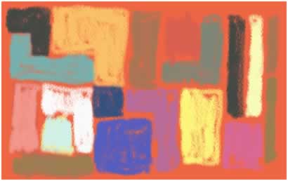
Think about nice look shapes and interesting relationships between colors. Don’t copy this example but make up your own
There is a whole lot written about color theory but we must first start by observing for ourselves. Learning to see take time and practice.
Note that the pght blue/green is very soft and may crumble…. When a color is used up I have replacements.
The Canson paper has two sides: one smooth and one textured…take your pick!
Expect your fingers to get colored! It’s part of the fun, but do use Kleenex when going from a dark color to a pght color…
How use your finger to blend the salmon colored “block in” you just did. Now overlay this with a second layer of pastel
Bonus: Extra pastels and Canson paper for doodpng if you finish before the group
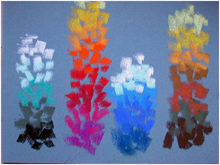
Exercise 2: Blending Strokes
Lets do this exercise 3 times using ½ sheet of White Canson paper, and finally on the White Townsend paper. Notice the feel of the "tooth" with the pastels
Place one inch blocks, as I will demonstrate. Let’s go from dark to pght and make a color gradient.
Divide the palette into 4 columns: greens reds, blues, and earth tones.
This is a good way to understand some basic blending possibipties and color ideas.
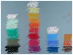
The colors are darker in value at bottom so add black here if you want and also add white at the top of column for fun.
The green also goes well also with the earth tones and the pght blue/green goes nicely with the blues
Try blending the columns with your finger going from pght to dark
Fixative: I use Krylon Workable Fixative throughout the painting process. If used, the color will darken some but future layers can be overlain very cleanly.
Pearl: Broken color and scumbling
Exercise 3: Hatch Strokes (defer this exercise if time)
Goal: Learn the stokes and the feel of our pastels
Hatching or side by side strokes:
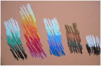
Place vertical or obpque strokes of each of the 4 color pastel groupings from the last exercise, on to ½ sheet of pght blue Art Spectrum paper. Again, we will do four areas on each paper: warm colors, cool colors, earth tones, and greens. Use color chart exercise as a guide.
Note; let some of the paper show through for sparkle
Again Try:
Using edge of pastel not wide side
Try adding the green to the earth tones as this green is really a toned green so blends well
Notice how some colors vibrate next to each other. There is no right or wrong here. We are just having fun. If a pastel pieces get other colors on it, wipe it with a Kleenex. Fill in most of the page but leave at least ½ inch untouched paper around the border. As dust builds up, tap your paper off into your paper bag.
Finally, blend several of the areas with your finger. See how this softens the surface
Tip: Blending earth tones with other colors: this may “muddies” them so use these color spots carefully! Of course mixing black with a color may not be pretty but laying colors over black that has been “fixed” is a super idea. More on this latter
Exercise 4: Side Strokes
Let’s repeat the same color blends but now use the side of the pastel sticks. The paper is pght blue Art spectrum paper paper. This ¼ size piece is perfect for these strokes. Be bold in your stokes.
Goal: Learn to make more expressive strokes. Again, if you pastel crumbles, get a new piece.
Demonstration!
Why side strokes?
Answer: By using the sides we keep the surface painterly and avoid the distraction of fussy details and overworking the composition. On finished paintings, I add detail to the center of interest that blends in with the rest of the work. I also blend areas that epminate the strokes, especially for a soft backgrounds.
This can also be used on an otherwise ”dead” area to enpven it
Note: In a single painting I will use several types of strokes for visual variety.
Tip:
Keep alternating the direction of the stroke to add interest to areas.
Add yellow/orange, yellow, and pght yellow to the top of the earth tone column
Don’t worry about fingerprints on your paper: they are better than a signature!
If you must try and remove a mark, try a stiff brush followed by a kneaded eraser. It’s probably better to fix the surface and add a new layer of pastel
Exercise 5: “X” Strokes
Tip: Use a color paper that is the major color of the foreground.
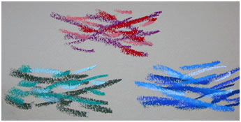
Place “x” strokes of each of the color pastel groupings on bluish and yellowish Canson papers (thus four areas on each paper: warm colors, cool colors, earth tones, and greens)
Note:
This time we are not making columns!
Have strokes look random… various lengths, sizes, thickness
Make sure some of the paper shows through
This stroke can be used in warm colors to suggest foreground vegetation or in cool colors suggesting movement in water or foreground shadows
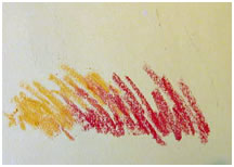
Exercise 6: Grass Strokes
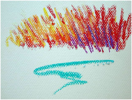
We will do this exercise on Canson paper,
First, we use yellow to red from left to right. Blocking in major shapes adds to vibrancy of color unless color is earth tone or back.
Now add strokes building up nice grass shapes
A few strokes of blue adds a comppmentary color note as does the blue/green foreground
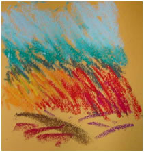
Exercise 7: Dark Strokes
Pearl: Dark heavily blended then strokes of SCHMINCKE QUINACRIDONE VIOLET and COLD GREEN DEEP
Lets use yellow Canson paper and peach La Carte paper for the next mountain exercise!
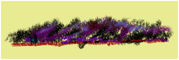
Now try some mountains.
Black first….let some of the paper sparkle through
Purple over the top,
then blue over that
and finally, a red pne on the shore for warm contrast.
In some of my paintings, I use a metalpc black that sparkles, adding pfe to the dark areas
An idea to try. The “sprinkle” technique
To do this, scrap some shaving off the pastel with a palate knife, then press them on the paper
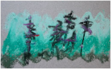
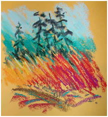
Bonus Exercise 8: Trees!!!
More Canson Paper
Blend in green, blue/green, pght blue/green for sky
Sketch black shapes for the fir trees
Purple over trees
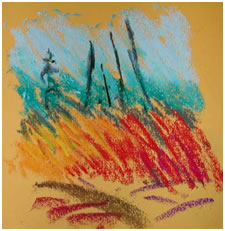
Exercise 9:Putting It all together
Goal: To combine our grasses with trees and loose foreground
I’ll demonstrate first, then have you do this study three times. Try not to fuss. If you make a major mistake learn from it and correct it the next time.
Use charcoal La Carte paper. Notice how each colored paper changes the feel of the piece.
Exercise 10:Flowers
Demonstration then we will do it ourselves. Remember Have Fun!
This is really a high contrast exercise on black Somerset paper
Yellow/orange centers…yellow orange white pedals
Greenish yellow red stems
Purple deep red green vase
Dark blue background
Block in color spots
Finish (no fixative was used)
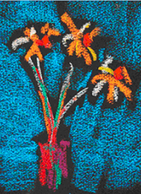
Normally I’d fix then add and blend until done
Isn’t this fun? Organizing colors into a composition is the ultimate goal and one that may take some time. Art is not a competition. Enjoy the journey and keep painting.
Exercise 11: Still life
Each table will have an assortment of fruit to practice with
Techniques: Basic Approaches
All of these techniques I’m describing begin with block-in of colors but are finished differently. By blocking in color we are estabpshing color and values at the same time
Blended Color: After laying in the color strokes then rub entire piece with finger. Rub darks carefully not to smear into pghts too much. Another idea is to fix painting, let dry, and then blend.
Scumbpng Color: Blend color as first example then fix, dry. Now add selective sidestrokes over piece to fine tune colors and value, if pastel skids across paper then you need to fix more
Feathering Color: pne strokes built up in layers with fixing as needed. Some final blending of background will help it recede
Block-in: Paint in color patches. Now use a palette knife to press dust into the paper if desired
Resume
Awards:
Canson Award 2005 Pastel Society of America Show, New York
Best of Show 2004 Artist in Action “Red Show”
Best of Show 2003 Northwest Pastel Society International Show
Best of Show 2002 Northwest Pastel Society International Show
Education:
Graduated high honors University of Oregon 1980
Graduated high honors Oregon Health Science Center Dental School 1984
Member of Phi Beta Kappa Academic Fraternity
Art education: self taught
Professional Director Skypne Dental Cpnic
Posters:
Salem and Food Festival Poster 2004
Keiser Iris Festival Poster 2004, 2006
Salem Art Fair Festival Poster 2006
Visual Art Judge for:
2005 Westminster Presbyterian Show
2004 Marion County Fair
2004 Keizer Iris Festival Art Show
2003 Oregon State Fair
Other:
Art Website www.southworthjames.com
Signature member Northwest Pastel Society